zucman: a data-viz kit for a tax policy argument
#dataviz#side-project#policy
Not everything I build is robotics. zucman is a side project — a campaign kit built to explain one chart to people who aren’t going to read the underlying economics paper.

The wealth of France’s 500 largest fortunes went from 6% to a peak of 42% of GDP between 1996 and 2024 (it’s eased slightly since, down to 36% as of the latest data), while — per an IPP study — paying proportionally less tax than the median citizen: roughly 27% versus something closer to 50%. That gap, not any particular political slogan, is the thing the whole kit is trying to make visible. The “2% floor” wealth-tax proposal associated with economist Gabriel Zucman is the policy response people usually reach for once they’ve seen the number; I’m not going to relitigate the policy debate here, I just wanted the underlying data to be something you could actually look at instead of take on faith.
What’s in it
- A sourced research dossier, so every number in every other asset traces back to something citable.
- Slide decks, in French and English.
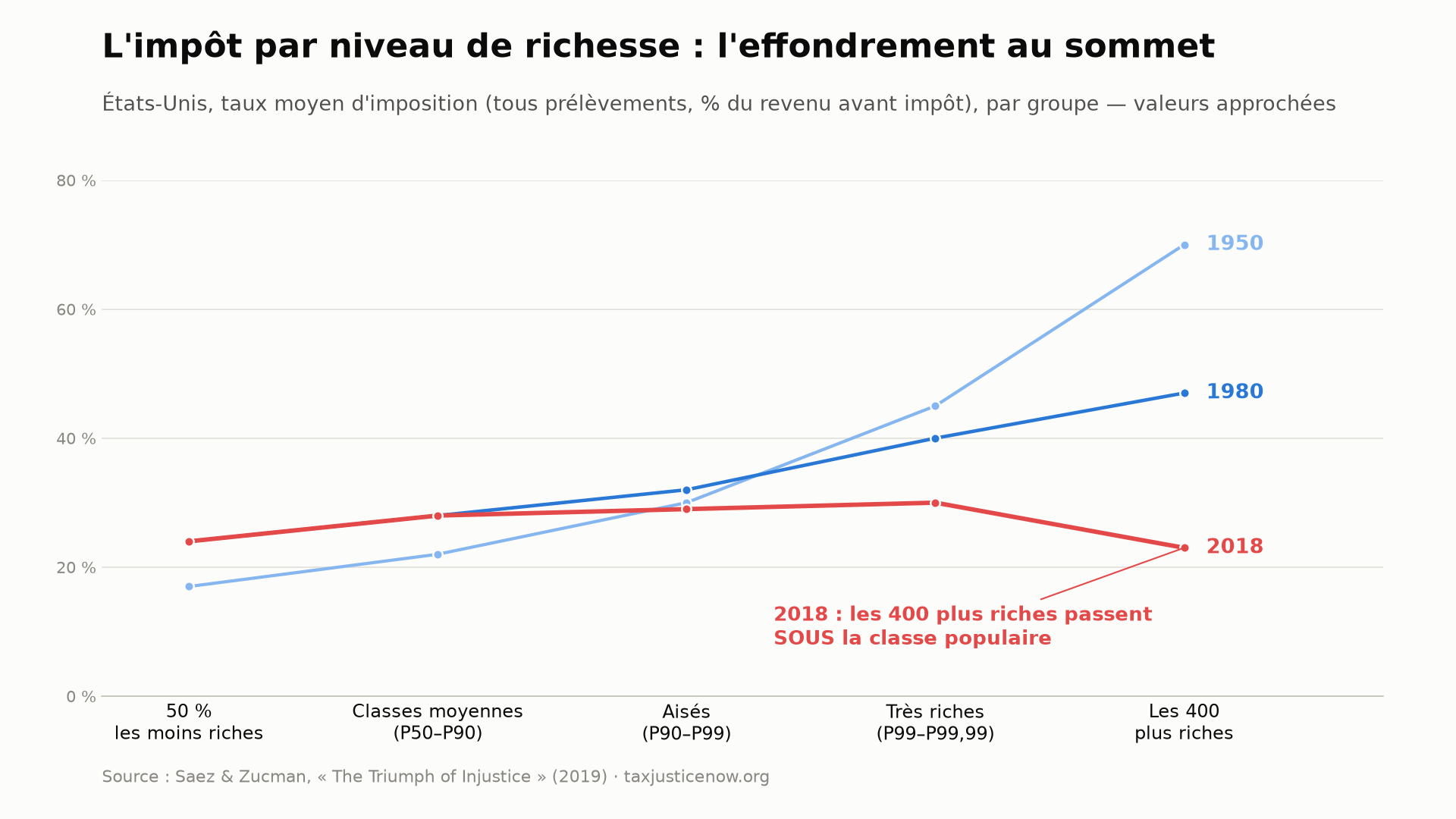
- Infographics, including a rebuild of the famous Saez–Zucman chart of effective tax rates by wealth bracket (US data, 1950 → 2018) — the one that made this whole argument go viral in the first place:
- A social kit — a Twitter/X thread, an Instagram carousel, a Twitch overlay, and a couple of 30-second promo videos, one of which is embedded right here:
- A static site at guilyx.github.io/zucman — one file, zero dependencies — with year-by-year interactive charts of top-end taxation collapsing across the West since 1980.
Everything’s mirrored in English, since the underlying data isn’t France-specific even though the immediate debate is.
Why it’s built the way it is
Nothing here is hand-drawn. tools/make_assets.py, tools/make_deck.js, and tools/make_promo_bracket_video.py regenerate every chart, deck, and clip straight from the source data, and CI checks the expected outputs actually exist after a run. It’s the same instinct behind pretty much everything else on this site: don’t hand-maintain something a script can derive correctly, every time, from one source of truth.